...
Button Icon | Name | Description | ||||||||||||||||||||||||||||||||||||||||||||||||||||||||
| Cursor | Selects one or multiple objects, to move or resize the object. The cursor is selected to escape out from any current annotation selection. This is also useful for selecting any annotation and changing properties or moving/scaling it. | ||||||||||||||||||||||||||||||||||||||||||||||||||||||||
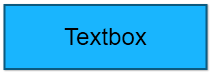
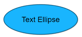
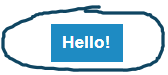
 | Text | Adds any text annotation on the image and canvas area. Text can be edited in all text annotations by double-clicking on the shape. Context menu changes when the text is in edit mode as shown below. Press Escape to come out of the edit mode.
| ||||||||||||||||||||||||||||||||||||||||||||||||||||||||
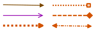
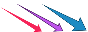
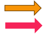
| Arrow | Draws an arrow on the image/canvas. All arrows are multi-instance types. Multiple arrows can be drawn with a selection.
| ||||||||||||||||||||||||||||||||||||||||||||||||||||||||
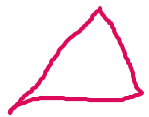
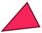
| Freehand Lines | Allows drawing freehand lines on an image. If the smart pencil option is enabled, the application tries to convert drawn shapes into geometric shapes. For example, if a triangle shape is drawn with a pencil tool, the application will convert into Triangle shape with sharp edges as shown on the right-hand side below.
| ||||||||||||||||||||||||||||||||||||||||||||||||||||||||
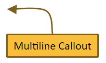
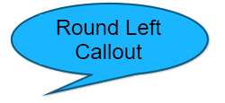
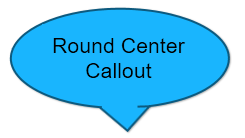
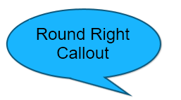
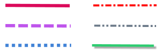
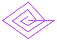
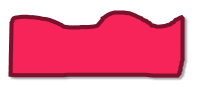
 | Geometric Shapes | Allows drawing different geometric shapes on the image.
| ||||||||||||||||||||||||||||||||||||||||||||||||||||||||
| Highlight | Highlights a region on the image. Highlight color can be selected from top toolbar or from the properties. See an example below with three different highlight colors.
| ||||||||||||||||||||||||||||||||||||||||||||||||||||||||
| Blur Rectangle | Blurs a portion of the image. This is annotation and can be moved and resized as required. see an example below with number plate and headlights blurred.
| ||||||||||||||||||||||||||||||||||||||||||||||||||||||||
| Image Border | It helps to set the border for the current image. This can also be done in the image toolbox. As this is one of the frequently used operations, this is exposed in the main toolbox. | ||||||||||||||||||||||||||||||||||||||||||||||||||||||||
 | Eraser | Erases a part of the image with white color. Width of the eraser can be selected from the outline width in the top toolbar.
| ||||||||||||||||||||||||||||||||||||||||||||||||||||||||
 | Sticky Note | Adds a sticky note annotation (to provide comments). This annotation is usually used to include a note to provide comments. A sticky note has two views. One is a collapsed view and another one is an expanded view. In the collapsed view, it can show a part of the note, say header and in expanded mode, it can show the full text. In view-only-mode, clicking on the note toggles the view.
| ||||||||||||||||||||||||||||||||||||||||||||||||||||||||
 | Counter Rectangle | Adds continuous numbering on the image/canvas. Option to reset the numbering is also available in the properties panel. Counter Circle: Adds a non-an editable circular counter. Counter Rectangle: Adds an editable rectangular counter that has options like cut, copy and paste on right-click. Counter Map Marker: This will set up the counters similar to markers on the map providing a pointer for each of the counters.
| ||||||||||||||||||||||||||||||||||||||||||||||||||||||||
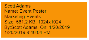
| Embed Image | Embeds an image in an annotation from a selected image file. Annotation can be resized as required. In the following, there are four embedded images on the screen. They can be resized and moved around.
| ||||||||||||||||||||||||||||||||||||||||||||||||||||||||
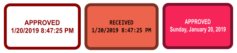
| Timestamp | Timestamp, Rubber stamp and Link annotations are grouped together. All these annotations are single instance annotations.
| ||||||||||||||||||||||||||||||||||||||||||||||||||||||||
| Clipart/Images | Displays a list of defined web URLs. Click on the links to open images in a browser. Drag and drop Clip art/Images from browser to the canvas. These images will be converted into embedded image annotations. They can also be dropped on the toolbar to import and open as a new image in a tab.
Note that not all images available online can be dragged and dropped onto the application. Some images are disabled by authors for download. If the image is too large to convert into the annotation, a warning message will be displayed. If the image is larger than 250KB, it is better to open it in a new tab by dragging and dropping onto the toolbar. The application will ask for confirmation for downloading the image and display it in a tab. Once confirmed, it will download the image from the web and import it into a new tab. Some images are copyrighted and need to be verified for compatibility before downloading. Default links can be changed and additional links can be added to this list using User Preferences→Clip Art tab as shown below:
Url links can be re-ordered by moving them up or down as required. | ||||||||||||||||||||||||||||||||||||||||||||||||||||||||
 |
| Adds a selected vector icon on image and canvas. Recently selected icons along with a set of predefined icons are presented in a popup for the selection. Outline and fill color are same as other shapes. Icon colors can be saved as default values for later use. Predefined Icons cannot be changed. Recently used icons change as new icons are used on the image.
Any icon can be selected and dropped on canvas. Icons can be duplicated using 'Control + D'. | ||||||||||||||||||||||||||||||||||||||||||||||||||||||||
| Vector Icon browser | A large collection of vector icons are displayed in the Icon Browser, which is embedded in the application. These icons, which are more than 5000, can be copied or dragged and dropped to the image/canvas. Various types of icons are displayed in tabs. Different groups of icons are displayed in different tabs. Free text search can also help to identify relevant icon. Icon browser is shown below:
|


...
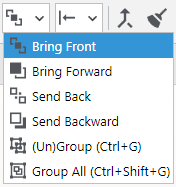
Annotations can be arranged using the toolbar annotations order combo-box as shown below:

|  | Bring Front:Moves selected annotations to front. |
 | Bring Forward: Moves selected annotations on top of other annotations. | |
 | Send Back: Moves selected annotations back. | |
 | Send Backward: Moves selected annotations behind all other annotations. | |
 | (Un)Group: (Un)Groups selected annotations on canvas. | |
 | Group All: Groups all annotations on canvas. |
Align Annotations
Aligns multiple annotations in user-selected format.
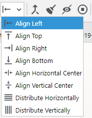
 | Align Left: Aligns selected annotations to left. |
 | Align Top: Aligns selected annotations to top. |
 | Align Right: Aligns selected annotations to right. |
 | Align Bottom: Aligns selected annotations to the bottom. |
 | Align Horizontal Center: Aligns selected annotations at the center horizontally. |
 | Align Vertical Center: Aligns selected annotations at the center vertically. |
 | Distribute Horizontally: Annotations will be distributed horizontally. |
 | Distribute Vertically: Annotations will be distributed vertically. |
...
Annotations are dynamic. They can be added, removed and changed as required. Sometimes, annotations need to be flattened and merged with the image. This is helpful for image operations on the annotations. There are three ways of flattening annotations. This can be accomplished using the icon button, in the top toolbar or from the context menu in the image display area.

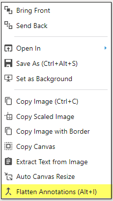
Flatten selected annotations
...