Annotations
- Doc Team
Before covering how to annotate images, it is important to know the concept of image canvas and virtual canvas. Application has two canvases, one is Image Canvas and the other is Virtual Canvas.
|
|---|
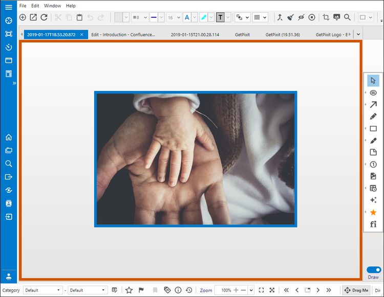
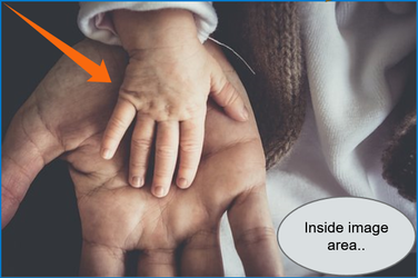
In the above picture, Region within the orange border that has the image is Image Canvas and the region between the orange border and the blue border is Virtual Canvas. This virtual canvas does not have any real boundary. Annotations can be added anywhere on the display space in Draw mode.
|
|---|
.png?version=1&modificationDate=1550031201201&cacheVersion=1&api=v2&width=750&height=581)
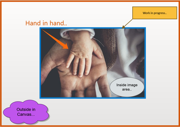
In the above picture, Annotations are created both on image and virtual canvases. There are two ways of exporting this picture to the clipboard. One is to flatten the annotations on image and copy image to the clipboard and the second is to flatten all annotations on the virtual canvas and copy it to clipboard.
|
|
|---|---|
| Copy Image to Clipboard | Copy canvas to Clipboard |
The following covers in detail, the image annotation functionality supported in the application.
Annotations help to draw text and various shapes on the captured image. These annotations help to enhance the image content. For example, a part of the image can be boxed in a rectangle with a text description. Annotations are objects maintained separately from the main image. These objects can be manipulated and changed as required. Annotations can also be flattened onto the image by pressing them onto the image. This will convert annotations to be part of the image. When images are exported, annotations are flattened by default resulting in an image with all annotations included.
There are two types of annotations. Single instance annotations and multi-instance annotations. Single instance annotations can be placed on image one at a time. Each time, the corresponding annotation need to be selected for placing it on the screen. In the case of multi-instance annotation, multiple instances of annotation can be drawn onto the image with one annotation shape selection. Any annotation selection can be canceled by pressing escape. In the following, annotation toolbox is detailed followed by examples for each of the annotations.
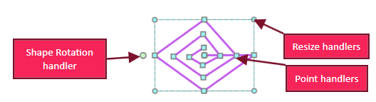
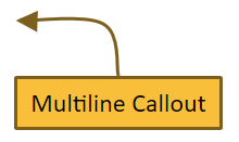
Toggle the button to switch between Draw (5) and Image mode (6) on the right-hand side of the editor. Draw mode has tools to annotate the image. These annotations include Text, Arrows, Lines, Counters and various shapes. When an annotation is selected, all edit handlers show up on the shape. These edit handlers include resize, move and rotate handlers. In addition, some shapes allow reshaping individual point positions on the shape. In the following, a multi-line shape is presented with all mouse handlers.
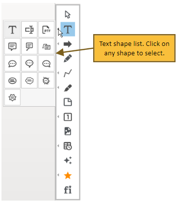
Draw toolbox contains groups of shapes. In order to see the full list of all shapes in a group, click on the small arrow on the left side to open the associated shape list. See below for text shape expansion (descriptions):
Button Icon | Name | Description | ||||||||||||||||||||||||||||||||||||||||||||||||||||||||
| Cursor | Selects one or multiple objects, to move or resize the object. The cursor is selected to escape out from any current annotation selection. This is also useful for selecting any annotation and changing properties or moving/scaling it. | ||||||||||||||||||||||||||||||||||||||||||||||||||||||||
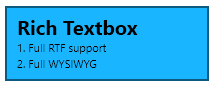
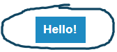
 | Text | Adds any text annotation on the image and canvas area. Text can be edited in all text annotations by double-clicking on the shape. Context menu changes when the text is in edit mode as shown below. Press Escape to come out of the edit mode.
| ||||||||||||||||||||||||||||||||||||||||||||||||||||||||
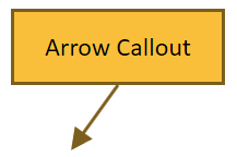
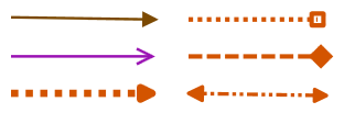
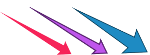
| Arrow | Draws an arrow on the image/canvas. All arrows are multi-instance types. Multiple arrows can be drawn with a selection.
| ||||||||||||||||||||||||||||||||||||||||||||||||||||||||
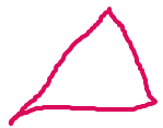
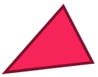
| Freehand Lines | Allows drawing freehand lines on an image. If the smart pencil option is enabled, the application tries to convert drawn shapes into geometric shapes. For example, if a triangle shape is drawn with a pencil tool, the application will convert into Triangle shape with sharp edges as shown on the right-hand side below.
| ||||||||||||||||||||||||||||||||||||||||||||||||||||||||
 | Geometric Shapes | Allows drawing different geometric shapes on the image.
| ||||||||||||||||||||||||||||||||||||||||||||||||||||||||
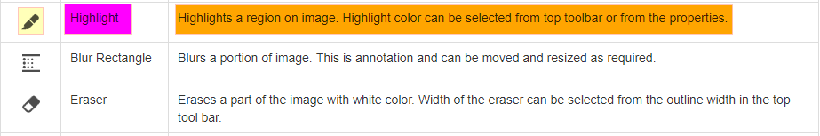
| Highlight | Highlights a region on the image. Highlight color can be selected from top toolbar or from the properties. See an example below with three different highlight colors.
| ||||||||||||||||||||||||||||||||||||||||||||||||||||||||
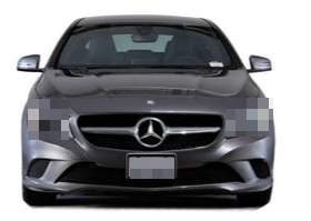
| Blur Rectangle | Blurs a portion of the image. This is annotation and can be moved and resized as required. see an example below with number plate and headlights blurred.
| ||||||||||||||||||||||||||||||||||||||||||||||||||||||||
| Image Border | It helps to set the border for the current image. This can also be done in the image toolbox. As this is one of the frequently used operations, this is exposed in the main toolbox. | ||||||||||||||||||||||||||||||||||||||||||||||||||||||||
 | Eraser | Erases a part of the image with white color. Width of the eraser can be selected from the outline width in the top toolbar.
| ||||||||||||||||||||||||||||||||||||||||||||||||||||||||
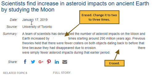
 | Sticky Note | Adds a sticky note annotation (to provide comments). This annotation is usually used to include a note to provide comments. A sticky note has two views. One is a collapsed view and another one is an expanded view. In the collapsed view, it can show a part of the note, say header and in expanded mode, it can show the full text. In view-only-mode, clicking on the note toggles the view.
| ||||||||||||||||||||||||||||||||||||||||||||||||||||||||
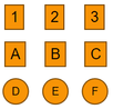
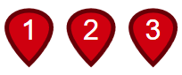
 | Counter Rectangle | Adds continuous numbering on the image/canvas. Option to reset the numbering is also available in the properties panel. Counter Circle: Adds an editable circular counter. Counter Rectangle: Adds an editable rectangular counter that has options like cut, copy and paste on right-click. Counter Map Marker: This will set up the counters similar to markers on the map providing a pointer for each of the counters.
| ||||||||||||||||||||||||||||||||||||||||||||||||||||||||
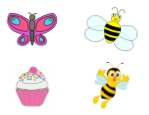
| Embed Image | Embeds an image in an annotation from a selected image file. Annotation can be resized as required. In the following, there are four embedded images on the screen. They can be resized and moved around.
| ||||||||||||||||||||||||||||||||||||||||||||||||||||||||
| Timestamp | Timestamp, Rubber stamp and Link annotations are grouped together. All these annotations are single instance annotations.
| ||||||||||||||||||||||||||||||||||||||||||||||||||||||||
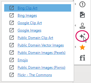
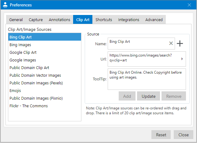
| Clipart/Images | Displays a list of defined web URLs. Click on the links to open images in a browser. Drag and drop Clip art/Images from browser to the canvas. These images will be converted into embedded image annotations. They can also be dropped on the toolbar to import and open as a new image in a tab.
Note that not all images available online can be dragged and dropped onto the application. Some images are disabled by authors for download. If the image is too large to convert into the annotation, a warning message will be displayed. If the image is larger than 250KB, it is better to open it in a new tab by dragging and dropping onto the toolbar. The application will ask for confirmation for downloading the image and display it in a tab. Once confirmed, it will download the image from the web and import it into a new tab. Some images are copyrighted and need to be verified for compatibility before downloading. Default links can be changed and additional links can be added to this list using User Preferences→Clip Art tab as shown below:
Url links can be re-ordered by moving them up or down as required. | ||||||||||||||||||||||||||||||||||||||||||||||||||||||||
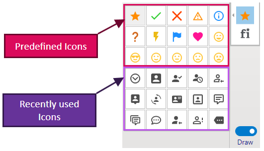
 | Vector Icons | Adds a selected vector icon on image and canvas. Recently selected icons along with a set of predefined icons are presented in a popup for the selection. Outline and fill color are same as other shapes. Icon colors can be saved as default values for later use. Predefined Icons cannot be changed. Recently used icons change as new icons are used on the image.
Any icon can be selected and dropped on canvas. Icons can be duplicated using 'Control + D'. | ||||||||||||||||||||||||||||||||||||||||||||||||||||||||
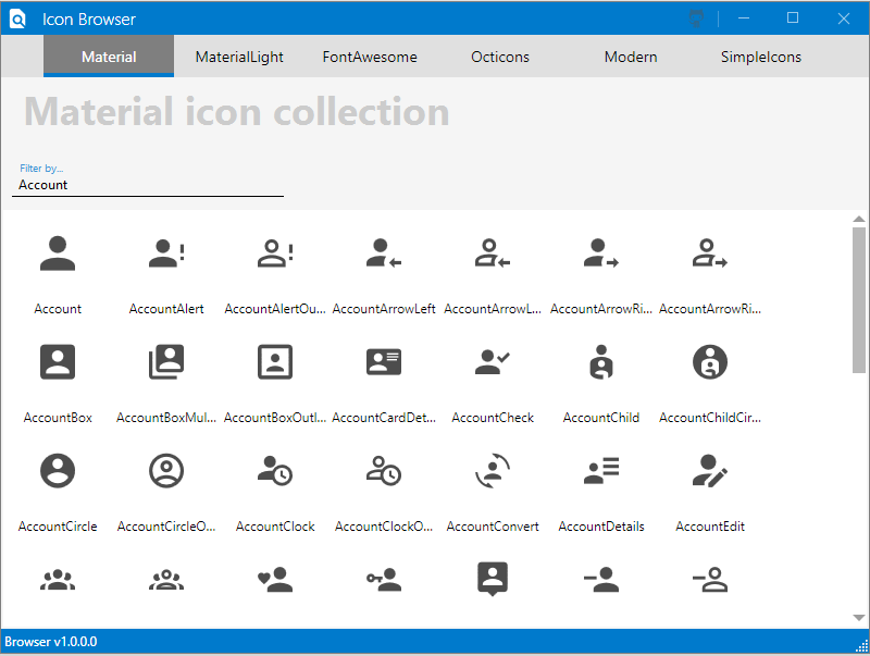
| Vector Icon browser | A large collection of vector icons are displayed in the Icon Browser, which is embedded in the application. These icons, which are more than 5000, can be copied or dragged and dropped to the image/canvas. Various types of icons are displayed in tabs. Different groups of icons are displayed in different tabs. Free text search can also help to identify relevant icon. Icon browser is shown below:
|


Shape Properties and Conversions
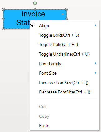
Shape properties can be opened by right-clicking on the selected shape. It will open a context menu as presented below for the textbox shape:
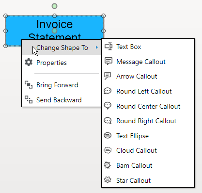
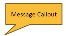
Context menu options include 'Change Shape To','Properties', 'Bring Forward' and 'Send Backward'. 'Change shape to' option is available when it is possible to convert a shape into another shape. In the above example, textbox can be converted into Message Callout. If the Properties menu option is selected, the application opens a corresponding properties window next to the shape. Properties window is presented below for textbox. Shape properties consist of Style, Text, Effects, Size, and Preset properties.
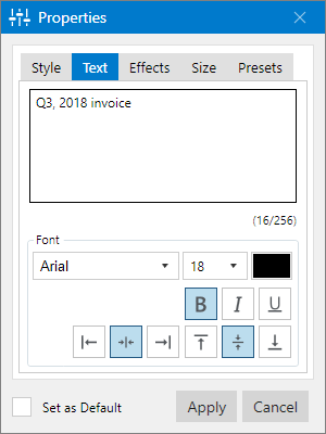
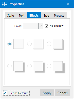
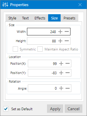
Style properties include Outline, Fill and Arrow properties. Text properties include text, font, text styles, and alignment properties. Effects cover the shadow and shadow colors. Size tab enables to change the size, location, rotation angle properties. Finally, the Presets tab helps to set border, fill and text colors by selecting a preset color combination. Color combinations are carefully selected in presets for best compatibility.
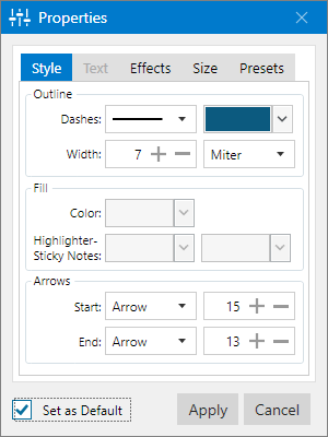
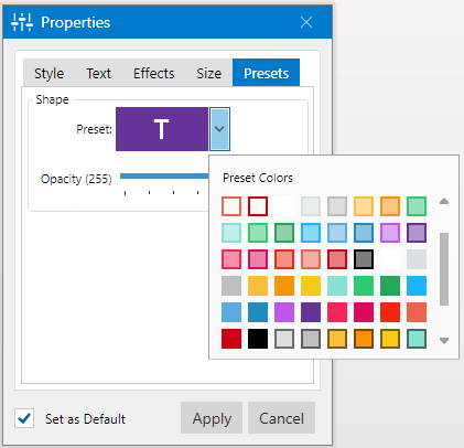
If a particular set of properties are appealing, they can be set as default by selecting Set as Default checkbox and clicking the Apply button. Next time, when the same shape is used, saved defaults are applied. In addition to using properties dialog to change annotation properties, additional quick help is provided from the toolbar.
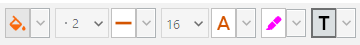
Favorite Properties: Top toolbar provides important annotation property change controls without requiring to open the properties window. These cover most frequently changing annotation properties and act as favorites. The following shows the Tool Bar properties. These favorite properties are applied to the selected annotations as applicable. The annotation needs to be selected first and by clicking on the property button, the corresponding style can be applied to the annotation.
Arrange and Group Annotations
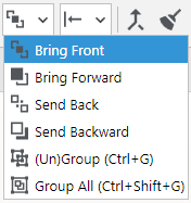
Annotations can be arranged using the toolbar annotations order combo-box as shown below:
|  | Bring Front:Moves selected annotations to front. |
 | Bring Forward: Moves selected annotations on top of other annotations. | |
 | Send Back: Moves selected annotations back. | |
 | Send Backward: Moves selected annotations behind all other annotations. | |
 | (Un)Group: (Un)Groups selected annotations on canvas. | |
 | Group All: Groups all annotations on canvas. |
Align Annotations
Aligns multiple annotations in user-selected format.
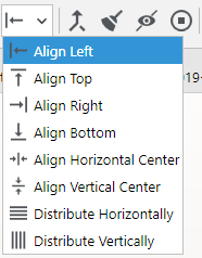
 | Align Left: Aligns selected annotations to left. |
 | Align Top: Aligns selected annotations to top. |
 | Align Right: Aligns selected annotations to right. |
 | Align Bottom: Aligns selected annotations to the bottom. |
 | Align Horizontal Center: Aligns selected annotations at the center horizontally. |
 | Align Vertical Center: Aligns selected annotations at the center vertically. |
 | Distribute Horizontally: Annotations will be distributed horizontally. |
 | Distribute Vertically: Annotations will be distributed vertically. |
Flattening Annotations( )
)
Annotations are dynamic. They can be added, removed and changed as required. Sometimes, annotations need to be flattened and merged with the image. This is helpful for image operations on the annotations. There are three ways of flattening annotations. This can be accomplished using the icon button, in the top toolbar or from the context menu in the image display area.
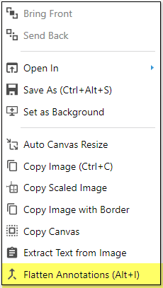
Flatten selected annotations
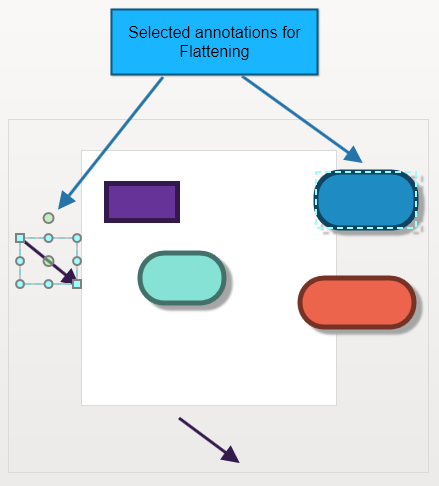
Selected annotations are flattened. Image canvas gets expanded as required to encompass the selected annotations. See the following example:
The white area is an image area. There are annotations inside and outside the image. Selected annotations are line arrow and rounded rectangle. |
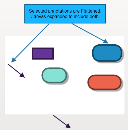
Selected annotations are flattened. Note that the image (white space) canvas is expanded to include both shapes. There is an additional space-padded at the edges. This padding can be controlled in User preferences using the Annotations→Default Auto Canvas Expansion parameter. |
Flatten all annotations on the image
All annotations on the image are flattened. In this case, the canvas is not expanded. Just the annotations are merged with the background image. This is useful when annotations on the virtual canvas need to be maintained.
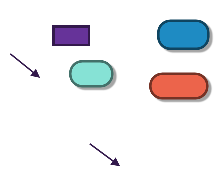
Flatten all annotations
All annotations are merged with the image. Canvas is expanded as required. The following picture shows the flattening of all annotations on the canvas, for the above example.
Remove All Annotations ( )
)
When there is an overwhelming number of annotations on the screen, it may be easier to get started from scratch. This happens when prototype wireframe designs are being made. Instead of selecting all annotations and removing them, click on the sweep button, , to remove all unflattened annotations on the image.
Hide/Unhide All Annotations( )
)
If there are a large number of annotations on the image, they can be hidden by clicking on the hide icon button in the toolbar,  . This is very useful if image operations need to be done for a portion of the image behind annotations. Annotations can be displayed again by unselecting the same button.
View/Edit Annotations ( )
)
By default, all annotations are editable on an image. Annotations can be made non-editable by clicking on View/Edit annotations icon button on the toolbar. This will help prevent accidental annotation changes while viewing images.
Pixtel | Capture. Share. Manage.