Introduction
Pixtel is an innovative screen capture, share, and management software. It enables capturing and recording screens and audio in a variety of ways and facilitates sharing them with cloud and non-cloud applications seamlessly. It also comes with an editing tool for image annotations and modifications. This application lets the user capture high-quality images/videos/audio, manage and organize them under different groupings such as Categories, Subcategories, Tags, etc., which will, later on, be Pixtel helpful while searching for a particular image.
Just press a hotkey and Pixtel will take a screenshot of your screen or the entire window with extensive capture option support. Inbuilt app integration supports cloud sharing with Google Drive, OneDrive, OneNote, Box, DropBox, Facebook, Jira, and others. The application contains a single highly usable window with most of the functionality available through icon buttons, located around the border. Both capture and editing tools are in one place.
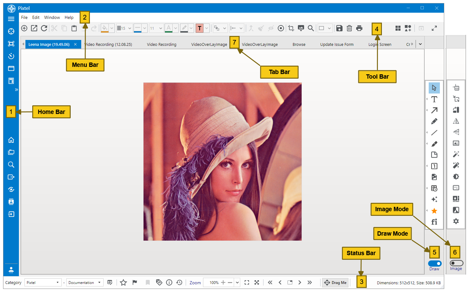
Figure 1: Pixtel Main Window
All features are available around the main window on four sides leaving the central area for image display. All features are grouped into meaningful sections. Home Bar on the left comprises of capture buttons on the top, management buttons with fly-out panels in the middle and user preferences in the bottom. Menu Bar on the top has File, Edit, Window and Help menus. Status Bar In the bottom displays captured image properties along with image navigation and DragMe buttons. Tool Bar on the top, right below the menu bar, consists of common buttons for annotation editing and changing properties, in addition to grid view and smart pencil buttons on the top right. Image annotation and image editing tools are located on the right. These tools can be toggled using a toggle button on the right bottom. Each of these tools is explained in detail in detail in the following sections.
Home Bar (1)
The home bar, located on the left side, has options to capture images, manage the captured images and to set user preferences.
| Button Icon | Name | Description |
|---|---|---|
| Capture Buttons | ||
 | Region Capture | Captures a selected region of the screen. Press Escape or right-click to cancel the operation. Press 'r' to retake the region again. |
| Full-Screen Capture | Captures the full screen of the current working window with the taskbar. |
| Timed Capture | Captures a selected region of the screen after 10 seconds. This helps to interact with the window and select the required menu/submenu when the timer is running. |
| Active Window Capture | It opens a grid view of all active windows. The full screen of a selected window is captured. |
| Scrolling Window Capture | Captures the browser page/application window content scrolling the page/panel content down and taking successive screenshots and stitching them together at the end. Overlapping and common areas can be clipped off by setting a configuration parameter. |
| Expand Additional Capture Options | Additional capture options can be opened in a pop-up menu.
|
| Management Fly-outs | ||
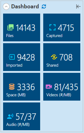
| Home | Displays a dashboard view with image counts for captured, imported, shared images along with the amount of space taken by them. An example view is presented below:
In addition to statistics, Get Started section in the Home fly-out with help links is available in the bottom section. These quick help links take the user to online documentation and training videos. |
| Browse | This helps to view the images by category, sub-category, and creation date. Recently captured and modified images can also be quickly browsed. |
| Search | Opens a fly-out with image search panel to search images based on various image properties including Category, Sub-category, Tags, and Display name. |
| Export | Helps to export file(s) in different formats: Bmp, Gif, Jpeg, Png, and Tiff. Files can be saved in predefined folders: desktop, pictures, documents, and videos. In addition, files can be saved in Zip format with the Category/Sub-category folder structure. The last 20 recent folders are stored in the system for saving images without requiring navigation every time. |
| Share | Shares the selected images to multiple cloud uploads, office exports, and applications such as Jira, Facebook, etc. |
| Contacts | Helps to manage Contacts in this flyout. These contacts are used for contact email address auto-fill support in the email sender component. |
| Import | Imports files from the local file system. Files to be imported can be selected and reviewed before importing. Once files are imported, they are copied internally and are managed by the application. |
| User Preferences | ||
| User Preferences | Users can change preferences/options for various application components here. There are no explicit saving requirements. When a parameter value is changed, it is effective immediately, except in some cases where explicit save is required. For example, the Capture Mouse Pointer option helps to include the cursor in the captured image. |


Menu Bar(2)
The menu bar has the operational menus providing a way to the features. However, almost all menu items have corresponding icon buttons in the main window. So, usually, users don't need to open menus for accessing application features. More than 95% of features are accessible through icon buttons in the main window.
Each of the menus and submenus is explained below.
| Menu | Submenu | Description |
|---|---|---|
| File | File menu has commands to Open, Capture, Save, Delete, Print, and Close images. | |
New Image | Creates a new image. This opens up a dialog to create a new image. Both width and height are filled based on either the current application's main window size or using values from the preferences. Background color can be changed as required. By default, it is white. Note that the transparent background color is displayed as white on the screen. However, when it is exported, transparency is maintained. | |
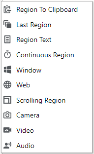
New Capture | It provides multiple options for capturing a screenshot. Region: Captures a selected region of the screen. Press Escape or right-click to cancel the operation. Press 'r' to recapture the region again while dragging the cursor. Region to Clipboard: Captures a selected region of the screen. Instead of importing the image into the application, it copies the image to the clipboard directly. This is very helpful for ad-hoc screen captures that are not required to be saved after use. Last Region: The recently captured region will be used to recapturing the screen. This is useful when a particular region is changing and it needs to be captured multiple times. Region Text: Extract & capture text from any image or screenshot. This is available only on Windows 10 and above. If the text to be extracted is small, try to zoom into the image for better text extraction accuracy. Once the text is captured, it can be edited and copied into the clipboard. Full Screen: Captures full display screen. If there are multiple monitors, they are listed in Displays submenu. The primary screen is the default screen set for the system. This can be overridden in the user preferences. For example, if there are two monitors. Any of them can be set as a primary screen in user preferences. When full-screen capture is executed, it takes a full-screen image of the primary display, as set in the preferences. Sub-options in the menu are outlined as below:
Active Window: Captures the full screen of the selected active window. Corresponding application is opened and brought to the front and the screenshot of the window is taken. Timed: Captures a selected region of a window after a time delay. The default timer value is 10 seconds and this can be modified in User Preferences. Continuous Region: Continuously captures a selected region at a specified interval selected by the user and the first capture is displayed in the editor. Using the navigation buttons in the bottom middle section, the rest of the captures can be viewed or opened in separate tabs. Window: Captures different portions of the most recent window as per user selection. Only recognizable windows in an application can be selected. Web: Captures the web page of the Web URL provided by the user. Browser size and delay can be modified as per user requirement. In addition, URI can be opened in a browser for the proper capturing of dynamically rendered components. This is highly recommended for web page capture to get high-quality images. Scrolling Window: Captures a scrolling web page/document/window completely from the first click to the end of the page by automatically scrolling the content. There is a two-second delay set in the preferences to pause after each page down to enable the application to render all components before taking a snapshot. Scrolling Region: Captures a scrolling web page/document/window completely from the first click to the end of the page by automatically scrolling the content. A region of interest for scrolling needs to be selected before capturing. This helps to remove unnecessary common content from the scrolling page. Sometimes, pages contain a left-side area dedicated to navigation. For scrolling captures, these regions are not required. There is a two-second delay set in the preferences to pause after each page down to enable the application to render all components before taking a snapshot. This can be adjusted as required. To cancel the scrolling in between clicks, use Windows or Alt button or press Escape button. Camera: The camera of the system is used to capture the image. Users can adjust camera settings and capture images. Video: Comprehensive screen recording helps to record product demos, instructional videos, webinars, etc. While recording videos, screen snapshots can be taken as well. Audio: Records audio from speakers and microphone with screenshot support to recognize the audio when searching for easy identification. | |
New from Clipboard | Imports the image in the clipboard and displays it in a tab. | |
Open-File (Ctrl+O) | Opens a selected image from a file. The corresponding image is imported into the application. Any changes to the imported image will not impact the original image. | |
Close (Ctrl+W) | Closes the currently opened tab. | |
Save (Ctrl+S) | Saves the image in a file from the active tab. | |
Save As (Ctrl+Alt+S) | The file will be saved with a user-specified name and format in a selected directory. | |
Delete(Ctrl+Alt+D) | Delete’s selected image. | |
Print(Cntl+P) | Print’s images with a variety of settings. | |
Close (Alt+F4) | Closes the application window, but application runs in the background and appears in the tray. Users can perform all capture options. Refer to Tray Options in this document. | |
Quit (Alt+F5) | Shutdowns the application. | |
| Edit | Edit menu has commands to Undo, Redo, Cut, Copy, Paste, etc... | |
Undo (Ctrl+Z) | Undoes the most recent action. | |
Redo (Ctrl+Y) | Redoes the most recent action that is undone. | |
Cut (Ctrl+X) | Cuts any selected annotation/text. | |
Copy (Ctrl+C) | Copies selected annotation/text. | |
Paste (Ctrl+V) | Pastes the clipboard data on image or canvas if the clipboard content is compatible. In the case of text in the clipboard, a text annotation is created and text is copied into the annotation. If the image is in the clipboard, image annotation is created with the clipboard image. | |
Clear Clipboard | Clears the contents of the clipboard. | |
Duplicate Annotations(Ctrl+D) | Duplicates the selected annotation(s). | |
Delete Annotation (Del) | Deletes the selected annotations on image or canvas, if no annotation is selected, it deletes an image in the active tab. | |
Select All (Ctrl+A) | Selects all the annotations on image and canvas. | |
Flatten | Flattens annotations in 3 ways 1. Selected annotations: Flattens only selected annotations. 2. All annotations on the image: Flattens annotations on the image after which they become a part of the image. 3. All annotations on the canvas: Flattens annotations on image or canvas and image canvas will be resized to fit all annotations | |
| Window | Window menu has commands to open Grid view, Home, Browse, etc. Options. | |
Grid View | Thumbnail view representations for all opened images in Pixtel. User can Select/ Deselect images to Share multiple files at a time. To close more tabs at one click, select required images and click Close Tabs. Please refer to Thumbnail View for more details. | |
| Home | Opens Home fly-out from left | |
| Browse | Opens Browse fly-out. | |
| Search | Opens Search fly-out. | |
| Export | Opens Export fly-out. | |
| Share | Opens Share fly-out. | |
| Contacts | Opens Contact fly-out. | |
| Import | Opens Import fly-out. | |
| User Preferences | Open the user preferences window. | |
| Help | The help menu has commands for registering and updating the product. | |
| Register | Helps to registers the product using the provided license key. | |
| Check for Updates | Shows any pending product updates which are not yet installed. It is recommended to keep the product updated. There are monthly updates with bug fixes and quarterly updates with enhancements/new features. | |
| About | Provides installed version number with a brief description. | |
Status Bar (3)
The status bar is located at the bottom of the application window that has options to set image properties such as category, subcategory, rate an image, bookmark, add tags, view image details, zoom, etc. Most importantly, it has buttons to navigate images in the sequence they were captured and also drag and drop the active image into an external application.

| Button Icon | Name | Description | ||||||||
|---|---|---|---|---|---|---|---|---|---|---|
| Category | It helps to categorize images for easy search. Users can add, edit, and remove categories and sub-categories in the Category Manager.
The category helps the user to group images according to their choice which helps with better organization and easy to search them. | ||||||||
| Rating | Enables providing a rating to the image. The rating range is 1-5. A rating stars pop-up shows up to select the rating. Depending on the rating, the color of star background changes. | ||||||||
| Flag | Flag helps to mark the image as important. If selected, it runs to red. | ||||||||
| Bookmark | The visual bookmark button is enabled if the image has a corresponding URL. This helps to find images that are bookmarked and corresponding websites can be opened using the 'Open in Browser' button on the top right. | ||||||||
| Tags | Tags help to describe an image/capture. Manage Tags: Click to open the Tag Editor window where the user can add, edit, delete tags and view file count. Tags can be added simply by typing the tag name followed by ';'. This will insert a new tag in the tag list and associates corresponding images to the tag. | ||||||||
| Image Info | Image details such as size, dimension, etc. are displayed. Users can edit the image name and add a description to an image. | ||||||||
| History | Gives the record of all the user actions on the image with versions. Users can revert back the changes of a particular version if required by selecting the row. | ||||||||
| Zoom | Users can Zoom in/out of an image.
| ||||||||
| Navigation | Navigating and opening images based on the capture order. | |||||||||
 | First | Opens the first image among all tabs. | ||||||||
 | Previous | Opens previous image of current tab. | ||||||||
 | Open in Tab/Place | Opens the images in separate tabs or in a single tab. To view each image in a separate tab, click “Open in Tab”. If an image is already opened in a tab, it is highlighted. To open all the images in a single tab, click “Open in place”. | ||||||||
 | Next | Opens the next image of the current tab. | ||||||||
 | Last | Opens the last image among all tabs. | ||||||||
 | Drag Me | Drags the current tab’s image to any application. | ||||||||
| Message | Message | Shows the current image dimensions and any active message corresponding to the recent operation | ||||||||


ToolBar (4)
The toolbar has icons to access tools for file operations and image annotation formatting and image manipulation. Draw Mode
Button Icon | Name | Description | ||||||||||||||||
| New Image (Ctrl+N) | Creates a new Image. Image width and height are derived from the main application window size or preset values in user preferences. | ||||||||||||||||
| Open-File (Ctrl+O) | Opens a file from the file directory and import the file into the application. | ||||||||||||||||
| Reload File | Reloads an image. This is helpful to restore the original file, in case the modifications made are no longer wanted. | ||||||||||||||||
| Cut (Ctrl+X) | Cuts any selected annotation/text. | ||||||||||||||||
| Copy (Ctrl+C) | Copies selected annotation/text. | ||||||||||||||||
| Paste (Ctrl+V) | Pastes the clipboard data on image or canvas. | ||||||||||||||||
| Undo (Ctrl+Z) | Undoes the most recent action. | ||||||||||||||||
| Redo (Ctrl+Y) | Redoes the most recent action that is undone. | ||||||||||||||||
| Fill Color | Fills background color to the selected annotation. | ||||||||||||||||
| Outline Width | Provides outline width to the selected annotation. | ||||||||||||||||
| Outline Color | Provides outline color to the selected annotation. | ||||||||||||||||
| Font Size | Applies font size to the selected annotation. | ||||||||||||||||
| Font Color | Applies font color to the selected annotation. | ||||||||||||||||
| Highlighter Color | Applies a highlighter color to the selected annotation. | ||||||||||||||||
| Preset Colors | Applies preset colors available to the selected annotation. Preset colors change fill color, border color, and text color. A set of preset colors are predefined for easier selection and proper look and feel. | ||||||||||||||||
| Arrange | Arranges annotations as per selection.
| ||||||||||||||||
| Align | Aligns multiple annotations in user-selected format.
| ||||||||||||||||
| Flatten Annotations (Alt+Ins) | Burns annotations on image or canvas. Opens a dialog with the following options:
| ||||||||||||||||
 | Remove All Annotations (Alt+Delete) | Removes all annotations on canvas. | ||||||||||||||||
| Hide All Annotations | Hides annotations on image and canvas. This is useful if there are a large number of annotations and image manipulation is required. | ||||||||||||||||
| View Annotations | Enabling this button disables annotation editing. | ||||||||||||||||
| Crop Image | Crops a selected part of the image. | ||||||||||||||||
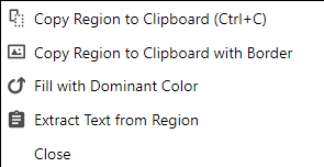
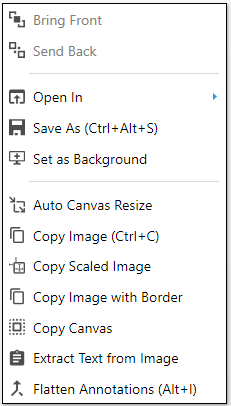
| Copy Image Area | Enables selecting an area of the image and operate on the selection. Selection can be copied into the clipboard, text can be extracted, and the area can be filled with a selected color. After selecting the copy image area, right-click to see the available options as shown below:
| ||||||||||||||||
| Magnifier | Magnifies any section or part of the image for a much detailed view. | ||||||||||||||||
| Image Area Selector | Enables to select an image area for applying image operations from the image toolbox. This is enabled only when the image toolbox is active. | ||||||||||||||||
| Save (Ctrl+S) | Saves the image. | ||||||||||||||||
| Delete (Del) | Deletes the selected annotations on image or canvas. If there are no annotations selected, it deletes the image. | ||||||||||||||||
| Print (Ctrl+P) | Prints the image. The print manager is opened for formatting print output. | ||||||||||||||||
| Thumbnail View | Shows the thumbnail view of all images in opened tabs. User can Select/ Deselect images to Share multiple files at a time. To close more tabs at one click, select required images and click Close Tabs. Refer to Thumbnail View for more details. | ||||||||||||||||
| Smart Pencil | In Draw mode, enable Smart Pencil and use Freehand lines to draw any shape on image or canvas.The drawing will be converted to the nearest geometric shape and the shape information is available in the description on the bottom right side. | ||||||||||||||||
| Open in Browser | If a web capture is made, the URL of that capture is remembered. Clicking this icon takes to that web page. | ||||||||||||||||
| Slideshow | Displays screenshots in slide mode. |


Draw Toolbox (5)
Toggle the button to switch between Draw (5) and Image mode (6) on the right-hand side of the editor. Draw mode has tools to annotate the image. These annotations include Text, Arrows, Lines, Counters and various shapes.
Button Icon | Name | Description | ||||||||||||||||||||||||||
| Cursor | Selects one or multiple objects, to move or resize the object. | ||||||||||||||||||||||||||

| Text | Adds any text annotation on the image and canvas area.
| ||||||||||||||||||||||||||
| Arrow | Draws an arrow on the image/canvas
| ||||||||||||||||||||||||||
| Freehand Lines | Allows drawing freehand lines on an image. If the smart pencil option is enabled, the application tries to convert drawn shapes into geometric shapes. | ||||||||||||||||||||||||||
 | Geometric Shapes | Allows drawing different geometric shapes on the image.
| ||||||||||||||||||||||||||
| Highlight | Highlights a region on the image. Highlight colors can be selected from the top toolbar or from the properties. | ||||||||||||||||||||||||||
| Blur Rectangle | Blurs a portion of the image. This is annotation and can be moved and resized as required. | ||||||||||||||||||||||||||
 | Eraser | Erases a part of the image with white color. The width of the eraser can be selected from the outline width in the top toolbar. | ||||||||||||||||||||||||||
 | Sticky Note | Adds a sticky note annotation. This annotation is usually used to add a note to the image. | ||||||||||||||||||||||||||
 | Counter Rectangle | Adds continuous numbering on the image/canvas. Option to reset the numbering is also available. Counter Circle: Adds a non-editable circular counter. Counter Rectangle: Adds an editable rectangular counter that has options like cut, copy and paste on right-click. | ||||||||||||||||||||||||||
| Embed Image | Embeds an image in an annotation from a selected image file. Annotation can be resized as required. | ||||||||||||||||||||||||||
| Timestamp | Timestamp, Rubber stamp and Link annotations are grouped together.
| ||||||||||||||||||||||||||
| Clipart/Images | Displays a list of defined web URLs. Click on the links to open images in a browser. Drag and drop Clip art/Images from browser to the canvas. These images will be converted into embedded image annotations. They can also be dropped on the toolbar to import and open as a new image in a tab. | ||||||||||||||||||||||||||
 | Vector Icons | Adds a selected vector icon on image and canvas. Recently selected icons along with a set of predefined icons are presented in a popup for selection. These are font icons. In order to change the color of an icon, the font color needs to be changed. It acts as a foreground color for icons. | ||||||||||||||||||||||||||
| Vector Icon browser | A large collection of vector icons are displayed in the Icon browser. Icons can be copied or dragged and dropped to the image/canvas. |


Image Toolbox (6)
Image toolbox provides options for image manipulation including Resize, Rotate, Flip, adjust Brightness & Contrast and apply Effects, etc. on the image. This toolbox can be selected by clicking on the toggle button below the right-hand toolbox.
Button Icon | Name | Description |
| Resize Image | Re-sizes the image with the provided dimensions. |
| Resize Canvas | Re-sizes the canvas position, width, height, color, etc. with values provided. |
 | Rotate | Rotates the image clockwise at 90° increments. |
 | Flip Vertical | Flips the selected image and any annotations that are burnt on image or canvas vertically. Unflattened annotations are not rotated. |
 | Flip Horizontal | Flips the selected image and any annotations that are burnt on image or canvas horizontally. Unflattened annotations are not rotated. |
| Image Border | Enables the setting of the image border. A dialog is presented to select border settings. They can be saved as default for reuse. |
 | Image Auto Level | Auto levels (Automatically sets) the brightness and contrast of the image. |
| Image Auto Color Correction | Autocorrects the image colors |
| Brightness & Contrast | It helps to adjust the brightness and contrast of the image. |
| Image Formats | Supports converting into different image formats such as Grey Scale 8 bits/pixel. |
| Color Effects | Supports a series of color effects like Invert color, Black & White, etc. |
| Filters | Applies the selected filters such as eroding, blurring, and sharpening |
| Image Effects | Applies the selected image effect on a loaded image. |


Annotation Properties
Rightclick on annotation; a property window will be opened. Style, Text, Effects, Size, Presets options are available under “Properties” window.
Tab name | Description |
Style | Options to change properties of Outline, Fill and Arrows are present. |
Text | Text, URL and Font style options are available. The font icon color can be changed from here as well. |
Effects | Shadow Effect options are available |
Size | Size, Location and Rotation properties can be modified. |
Presets | Shape properties like Preset and Opacity can be modified. |
Tab Bar (7)
Application unlike any other screen capturing tools supports multi-tabbed interface. Multi-tabbed interface allows us to open and operate on multiple images at the same time similar to Internet browser tabs.
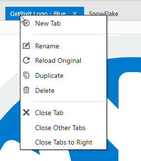
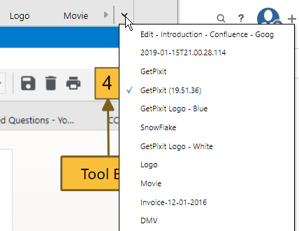
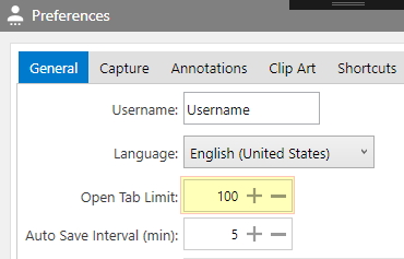
Users can have the same experience as a browser without requiring them to open one image at a time to review the content. Users can drag and drop, arrange, rename, duplicate, copy the tabs. The maximum tab limit can be adjusted in user preferences. Any opened document not visible in the tab-row can be viewed in tab dropdown.
Please see the tab bar options in the following screenshots:
Tab Context Menu: Right-click on a tab header to see the context menu | Tab List in a Drop Down: Click on the drop-down button at the end of tabs to see a list of all tabs. | Maximum Open Tab Limit setting in User preferences |
|
|
|
Canvas
The workspace to do all operations on the image is Canvas. The application supports two types of canvas, one is Image Canvas and the other is Virtual Canvas. Image Canvas is a region to view and edit images imported or captured in the application. The region around the image canvas after importing/embedding the image is the Virtual canvas.
The application supports adding annotations in both canvases. Virtual canvas helps the user not to worry about expanding the image canvas to add annotations. The tool will take care of auto canvas expansion when copied into external applications.
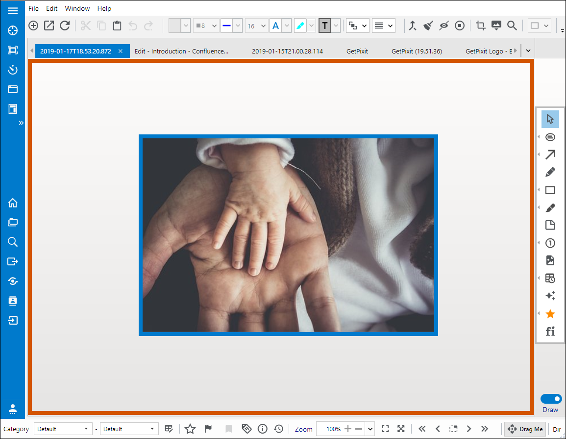
In the above Figure, the region within the blue border that has the image is Image Canvas and the region outside the blue border, but inside the orange border is Virtual Canvas.
Thumbnail View
- To open Thumbnail view choose
 icon from the Toolbar or navigate to “Window” -> “Grid view”.
 - This gives the thumbnail view of all the images opened in the editor. It helps the user to select or deselect required images that can be exported to any of the "Share" options.
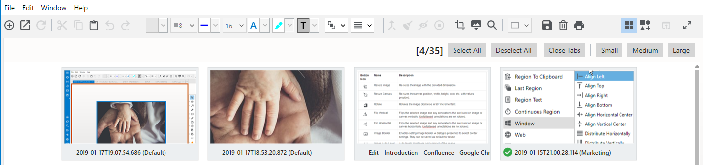
Thumbnail View
Tray Options
When the application is closed, the application will be in a minimized state running in the background. All capture operations available in the tray can be performed with Shortcuts or menu options. Shortcuts can be modified in user preferences. The editor can be opened by double-clicking the icon when it is closed.
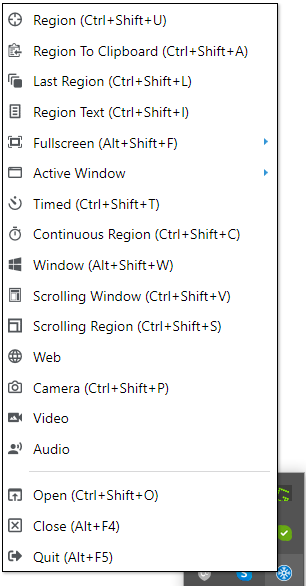
Image Properties
Pixtel users typically manage thousands of screenshots/images. In order to find a specific set of image(s), any of the image properties, (sub)category, tags, create/modified dates, rating and flag can be used.
Categories help to identify the appropriate images. Rating and flag are used to further differentiate images. Tags are helpful to associate keywords with the images. Details of the image such as name, file type, size, etc. are available in the Image info panel. Image properties can be changed in the bottom status bar.
Category:
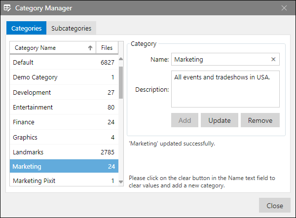
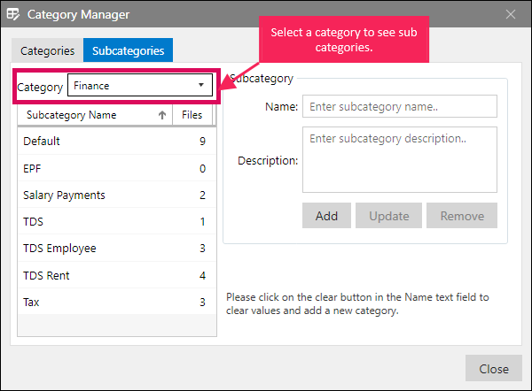
Users can add category and sub-category to images for better organization. These properties are used in searching for relevant images and also for sharing. By default, the category and sub-category are set to pre-defined default values (Default-Default). Any new capture taken will be initialized with default values. These can be easily changed. Each category can have any number of sub-categories. For example, Marketing category can have Events and Presentations as subcategories.
Click  button to open Category Manager for adding, updating and removing categories and associated subcategories. Please see the category manager in the following figure.
Select sub-category tab, choose a parent Category from the drop-down for managing sub-categories. Please see the following figure.
Rating:
Rating helps the user to give relative weight to an image. Rating is in the range 1-5.
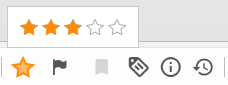
Hover on the stars and select the stars to rate an image. After the image is rated, the main star background color intensity changes appropriately.
Flag:
Click Flag icon,  , to flag the image.
Visual Bookmark:
For captures made from the web, visual bookmark, , enables to bookmark the image for retrieval.
Tags:
Click on,  , to enter tags or select from the listed tags for the active image. Each tag must be followed by ';' to add the tag. All new tags are stored in the repository and can be reused. These tags make it easier to search for images.
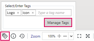
Click on Manage Tags button to open the tag manager interface for managing tags for all images.
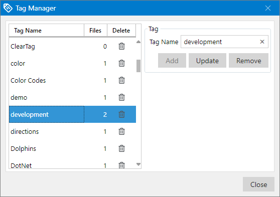
Image Info:
Image details are available by clicking Image info,  button. The image details are saved as image properties, which can later be used to organize and search images.
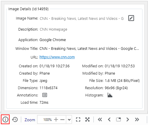
Both image name and description can be edited directly using the edit button in this pop-up. The description is used in exporting images to word format. 'Application' property is used to identify the main application that contains this capture and 'Window Title' corresponds to the title of the window or title of the web page. For images captured from the web, application stores the URL of capture, which when clicked will open the web-page in the browser.
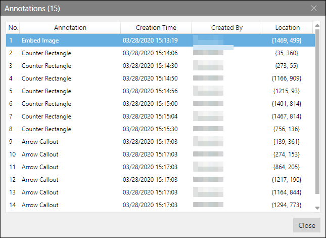
Annotations: For all the annotations added on the image, the corresponding details such as 'Annotation Type', 'Creation Time', 'Created By', and 'Location' are maintained. They will be helpful to design wireframe drawings in future product updates.
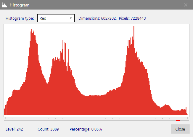
Histogram
Color histograms for Luminosity, Red, Green, and Blue can be obtained by clicking on the Histogram button in the Image Info panel.
Context Menu Options
Any image captured or imported has the following options available on the right-click:
| Icon | Menu Item Name | Description |
|---|---|---|
| Bring Front | Brings the selected embedded images, annotations on an image to the front |
| Send Back | Sends the selected embedded images, annotations on an image to the back |
| Open In | Opens the image in MS Paint, MS Picture Manager, Media Player, and System viewers. |
| Set as Background | Sets the current tab image as a desktop background. |
| Auto Canvas Resize | Image canvas gets expanded to include all the annotations that are outside the image area. This will help to include all annotations when the image is exported to external applications. | |
| Copy Image | Copies the image to Clipboard (Ctrl+C). |
| Copy Scaled Image | Copies the scales image into clipboard based on zoom settings. For example, if the zoom is set to 50%, the image is scaled down to 50% in size and copied into the clipboard. This helps to copy images of different sizes very easily without requiring explicit resizing when dealing with large images. |
 | Copy Image with Border | Copies the current image with the border to the clipboard. Border color is based on the default border color set for embedded image annotations. |
| Copy Canvas | Copies image along with annotations (e.g. Text, Icons) on the canvas to Clipboard. |
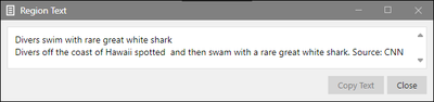
| Extract Text from Image | Extracts text from image which can be copied in any location by clicking Copy Text. Figure 16: Extract Text from Image |
| Flatten Annotations | Flattens annotations on image or canvas. Selected Annotation: Flattens only selected annotations on canvas. All annotations on the image: Flattens all annotations available on image and the burnt annotations now become part of the image. All annotations on the canvas: Flattens all annotations available on canvas and re-size canvas to fit all annotations in it. |


Pixtel | Capture. Share. Manage.